
Crushin' Portfolio Websites!!
We see so many websites now a days, and many sadly are almost painful to look at and use. Even among the many bad sites, there are still some gems waiting in the midst. Their good design, layout, and process is what really makes them stand out from the rest of the sites. These are some portfolio websites that appeal to me and stand out from the rest .
This site is so well done! It's layout is super clean and really eye catching, while still being usable enough for the viewer. It has neutral colors that reflect and resonate well with the content being shown on the page. The use of white as the main text color keeps the words bright in front of the full page previews of the work. Not only is his content exciting but so is the manner it was set up in. When you scroll down the page, you just want to keep searching and exploring. There aren't awkward gaps or spaces felt unused, and overall its a very clean and sleek portfolio site.
https://www.motionhouse.cz/work/hudebni-banka/
This site gets straight to the point and loads the home screen on a page full of project thumbnails. This is very enticing and intriguing to look at. All of the thumbnails are gifs as this is an animation portfolio, which gives the page so much movement. I like the use of the full page and the big heavy pictures covering the page. They also don't choose obnoxious colors, fonts, or hover options. This simple choice helps balance out the heavy media content they hit you with off the bat.
This page is the lightest out of the three I chose, but I like it because it fits well with their content. The page also relies on heavy picture based design, really emphasizing the projects they've chosen to showcase. This site uses really unique mouse hover settings that make me want to continue exploring the page to find and see all the different variations. I also like the layout of the site once you click on a project. You scroll through the project and then at the bottom are smaller thumbnails of other projects you can go look at next. This just keeps the viewer from thinking more and allows them to click on less. It is also nice because it keeps you pulled in just like Netflix and YouTube does when they automatically start playing the next video. This site has fun content and a fun design that matches the style of their work which connects it all together for me!
These sites all have designs that really reflect and work with their work they are showcasing. You can also get a sense of who the designer is and their personality which I feel brings a sense of personality to their page and brings their work to life for me even more.
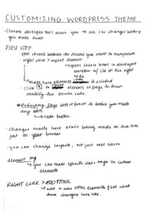
WORDPRESS THEME NOTES:
No comments.