December 12, 2017Comments are off for this post.

Instagram Insights

@rowemegandesign

This is the handle I chose for my Instagram account. From that point on, I began to build my account by gaining followers and posting different case studies of past and present work of mine. This account has be an wonderful and very enjoyable learning experience. Through this account I have learned to create a schedule so I am consistent with posting work, interacting with followers and companies, and creating the material that I highlight on my site. Many would think that posting on social media for a project would be something easy to do, but I can beg to differ. Being active on social media for a business or company, or for a cause is work, and if done right can seem effortless. This project was a fun way to branch out the RoweMegan brand, and to share my work with friends, family, and businesses. This project, like my portfolio site, will be a great opportunity to catch the eye of potential future employers, freelance opportunities, and allow me to branch out my web of connections in the industry.

INSIGHTS

What I found to be so intriguing about insights is just how much more your work is reaching people than you'd think. When I began to look at my insights, I realized just how many impressions my sight was leaving on people. Then once you start to dig deeper you find that the insights branch out to specific days. Once looking at these days you begin to see when I gained the most followers and what times weren't as successful. For my account I seemed to have the most following success during the hours of 9am until about 9pm. That Is a pretty wide window during which I continued to gain the following of my audience. Out of the entire week, I had the most attention on Wednesdays.


Instagram Insights also showed me the demographics of my following audience. Through this I found I had more women who follow me, and less men. It also showed me my base age range of followers and then broke it down for each gender. My average age range of followers is 18-24. This means I am reaching the category I am also in. By knowing this, I can begin to branch out to the younger and older age groups to branch out my brand to more than just one age group. I plan on doing this by interacting and following more of the Instagramers in these age groups and make a positive impact on them.


These insights will continue to change as my account develops and grows. With this knowledge in my pocket I can begin to gear my site towards the public I'd like to reach, and hopefully gain attention of future employers and freelance opportunities. This project has made me aware of my presence on social media, and how it can be used in a positive way to further my brand and work.


November 8, 2017Comments are off for this post.

Creative Brief for Portfolio Website

The website design I am creating is for my personal portfolio. This website will be used in my future to portray and display my work, designs, and art. It will include work I have previously done and will be updated with new work I develop in my career. It will highlight the Logo I created in a previous class, and will contain elements that reflect that logo and my design style. This will be seen by future employers, public eyes, family, friends, professors, and whoever stumbles upon it. It will include digital designs, printed designs, and various other works, in the hope to attract potential clients, businesses, and connections in the graphic design industry.

This site intentions are to reflect my brand as a designer and character as a perso

There are many moods/elements I hope to reflect through this site

  • Movement/Interactive
  • Clean/Simple
  • Geometric
  • Accessibility
  • Updateability/Versitality
  • Spotlight/Display
  • Self Explanatory/Effective
  • Pretty enough that it helps gets me a job!

The client for this project is myself, as the intent for this project is to create a site that highlights myself as a designer and further progress my design career and work.

My target will be all the people that I will be begging for jobs, my family who constantly asks what projects I've most recently been working on, and the random public that may possibly stumble upon my work in their browsing. This will serve as the platform to show off my brand as a designer and my work that shows my capability, professionalism, and skills.

My competition will be the loads of other designers who all want the same thing I do, a killer job. This site will however be tailored to show my best work and unique brand that these clients and employers will want.

I plan to have this site done by the end of the semester by its due date. However this will be a longstanding updatable site that will continue to progress and grow as I do as a designer in  my career.

November 8, 2017Comments are off for this post.

System Thinking

System Thinking Example: IDEO

IDEO decided to take on a giant undertaking of revamping the voting system in Los Angeles. They wanted to bring this vital part of our democratic system and bring it up to par with technology that we have today. They wanted to create a more flexible, accessible, modern, consistent, and enjoyable voting experience for everyone. (keyword there being everyone) IDEO did a good job of keeping these six concepts in mind as they created their design and system. This allowed for their system to be effective and successful!

Everything is connected;

From the beginning IDEO researched, learned, and listed out all the problems, constraints, and restrictions they would be under if they decided to take on this project. They new from the beginning that a lot of work coming up with some 600 problems that they would need to either solve, work around, revise, and overcome.

The system contains elements, purposes and connections:

To create this system they were very meticulous at developing a successful system of elements that ultimately connect back together. Knowing that they needed to bring purpose to their decisions in order for their elements to make positive and useful connections, and to overall create the kind of system they wanted. They also kept in mind that the way their elements, purposes, and connections would change overtime as the technology, public, and system continue to develop and change as time goes on. They made the parts in their specialized voting machine able to be upgraded and changed out as newer, better, and more efficient pieces develop. They were constantly thinking about the purpose of their design and the future of the final product, thus making sure this wasn't a superficial, short-lived project.

Stocks and Flows:

They kept in mind the fact that their connections need to be logical. An example of this during their project, was option of scanning in your ballot from your phone. This feature of the process allows the voters to look up their ballot beforehand. This helps the voter familiarize themselves with the options, set up, and process before it becomes time to vote. This is working in a proactive way, allowing them to later use their phone and the ballot they've created. It gives the voter a faster and more comfortable experience during the voting process.

Centralization and Decentralization:

The whole project centralizes around the idea and act of voting, but by allowing for their to be mulitple platforms and hubs where people can vote adds flexibility to this process.

Competition and Cooperation:

In their design they've got a lot of working and moving elements. This could cause for a cluster of clashing and overwhelming parts that would in the end bring their system down. But, since they kept in mind all of their guidelines, they knew which elements needed to be more prominent and important and which could have less a presence in the design. They pushed elements and kept other subtle and overall created a clean and effective design that worked with the wide variety of people who'd be using it.

Balance:

They created an overall theme for the design but allowed certain parts to be unique and not like others. Keeping an enjoyable, clear objective and experience for the voter. They balanced the advanced technology that they were pushing, by having a concise design that wasn't too complicated for the voter.


One thing I really liked about this project was the extensive time they took into developing and creating an experience that was worthwhile for EVERYONE! They made massive efforts to create a system that allowed people with disabilities to have independence in this process. They also created an experience that allowed for the stress, unknown, and constrictions of the voting process to be eliminated. From my personal experience, not knowing what the ballot would look like was a little nerve wracking, and trying to fit it into my day seemed to be difficult. They took away these problems by allowing for the viewer to download and look over their ballot before hand and also opened up the polling cites to many places around the area and for longer time periods.

October 24, 2017Comments are off for this post.

Portfolio Website Research

Crushin' Portfolio Websites!!

We see so many websites now a days, and many sadly are almost painful to look at and use. Even among the many bad sites, there are still some gems waiting in the midst. Their good design, layout, and process is what really makes them stand out from the rest of the sites. These are some portfolio websites that appeal to me and stand out from the rest .

Isadore Lookbook

This site is so well done! It's layout is super clean and really eye catching, while still being usable enough for the viewer. It has neutral colors that reflect and resonate well with the content being shown on the page. The use of white as the main text color keeps the words bright in front of the full page previews of the work. Not only is his content exciting but so is the manner it was set up in. When you scroll down the page, you just want to keep searching and exploring. There aren't awkward gaps or spaces felt unused, and overall its a very clean and sleek portfolio site.

https://www.motionhouse.cz/work/hudebni-banka/

This site gets straight to the point and loads the home screen on a page full of project thumbnails. This is very enticing and intriguing to look at. All of the thumbnails are gifs as this is an animation portfolio, which gives the page so much movement. I like the use of the full page and the big heavy pictures covering the page. They also don't choose obnoxious colors, fonts, or hover options. This simple choice helps balance out the heavy media content they hit you with off the bat.

WORK

This page is the lightest out of the three I chose, but I like it because it fits well with their content. The page also relies on heavy picture based design, really emphasizing the projects they've chosen to showcase. This site uses really unique mouse hover settings that make me want to continue exploring the page to find and see all the different variations. I also like the layout of the site once you click on a project. You scroll through the project and then at the bottom are smaller thumbnails of other projects you can go look at next. This just keeps the viewer from thinking more and allows them to click on less. It is also nice because it keeps you pulled in just like Netflix and YouTube does when they automatically start playing the next video. This site has fun content and a fun design that matches the style of their work which connects it all together for me!

These sites all have designs that really reflect and work with their work they are showcasing. You can also get a sense of who the designer is and their personality which I feel brings a sense of personality to their page and brings their work to life for me even more.


WORDPRESS THEME NOTES:

October 22, 2017Comments are off for this post.

Project 2

HTML and CSS

In this project we dipped our toes into the world of HTML and CSS coding. HTML stands for Hyper Text Markup Language, while CSS stands for Cascading Style Sheet. We took our resume and used HTML and CSS to code and stylize it. Throughout this project we learned to understand the world of coding and the relationship between HTML and CSS. I had never done anything like this before, but understand now just how vital it is to learn this skill!

Project Links:

http://rowemegan.com/resume_files/project2a_resume_version_01.html

http://rowemegan.com/resume_files/project2a_resume_version_02.html

http://rowemegan.com/resume_files/project2a_resume_version_03.html

http://rowemegan.com/resume_files/project2b_resume_version_01.html

http://rowemegan.com/resume_files/project2b_resume_version_02.html

http://rowemegan.com/resume_files/project2b_resume_version_03.html


October 17, 2017Comments are off for this post.

Project 2: Website Functions, Semiotics, and Anaylsis

Book Reading, Notes, and Analysis:

The book Don't Make Me Think, Revisited by Steve Krug brings up some really good points about web users and how we browse. Chapters 1, 2 and 3 all focus on how to build a website geared towards the viewer and how they process, browse, and use websites. After reading these chapters, I realized just how much of these design tools I just over looked because they became familiar and normal to me. Being aware of the obvious and simple design techniques can turn a bad website into a great one, that viewers will come back to revisit and use. One of the biggest take home points for me, was just how crucial it was to make the design and site simple. I feel as a designer I've always got a big picture in mind and sometimes get caught up in all the details that it becomes WAY to complicated. These chapters focused on making sites self explanatory and obvious for the user. After keeping this in mind I realized that many sites don't do this and overall, fail at making their users experience positive and beneficial.

Once we read these chapters, we went out onto the web ourselves and found sites that we thought were effectively utilizing the design strategies that these chapters talked about. Throughout my search, I found myself looking for tools I always just glanced over. I realized the intent behind all of these specific design decisions and how they reflected on the company and their products and their brand.

Website Research and Analysis:

https://www.nhl.com/wild/

  • This first link is for the website for the Minnesota Wild. I believe this website does a great job illustrating the motivation aspect of semiotics. I say this because as hockey is an exciting sport, the main design focuses on the game/players. Also, I think the site does a great job with it’s color palette. While yes the site does use the colors from the team, it lays out the colors in a way that organizes the information, and makes the navigational process easier for the viewer.

http://www.hyperlite.com/

  • The second link is for Hyperlite which is a wakeboarding company. This site does a great job of using signs to help the viewer navigate the page. I say this because all the text/signs are laid out either vertically or horizontally. The signs all flow between one another which results in the viewer’s eye being drawn across the entire page. This makes all the information easier to process, and allows the user to better navigate the page. Also, the images they use do a great job of representing the brand, and the laid back/modern feel that goes along with wakeboarding today.

http://www.cabelas.com/

  • The third link is for Cabela’s which is a hunting outfitter. This website does a great job of utilizing signs as well. Like the Hyperlite site, this site does a great job of creating flow between signs through out the page however, it does this in a different way. Unlike the Hyperlite site, this site organizes everything vertically, which draws the viewer’s eye downward. As the viewer is drawn downward, they are able to view and process all the information on the page making the site very easily navigable.

https://www.ronixwake.com/

  • The fourth link is for Ronix, which is another wakeboarding company. This site does a great job using a specific category of sign. The site uses signs which all depict real photos of athletes using their products. This signifies to the user that these are the kinds of products they can hope to find on this site. There is also a ‘shop now’ link directly below each photo which takes the user directly to the section of the website that deals which each respective category. This makes the whole navigation process very streamlined and simplified for the viewer.

https://www.fender.com/

  • The fifth link is for Fender which is a guitar manufacturer. This site does a great job of using iconic signs to help the viewer navigate the page. The most prominent image on the page is of three guitars which are named the ‘Fender Stratocasters’. The Stratocaster is a very iconic guitar design and has been used by many very famous musicians, so using this image as the most prominent sign on the page lets the viewer know what they can expect to find on this website. Also, the necks of the guitars all lead up, which draws the viewer’s eye to the top banner that contains the navigation tabs for the site.

www.prana.com

  • This website used simple clean organization of their information to create a website that is easy and self-explanatory for their customers. They use simple icons to show recognizable features such as the search and shopping cart features. These features are well known to many users of the internet, so not changing or trying to be innovative in this area helps keep this are of the site simple and effective. When you get to the dropdown features they succeed in their simple lists with easy to process word choices and break downs of options. They also use pictures to show certain features. Semiotics is used a lot through this site by colors chosen. We see colors that give a heavy sense of nature and earth which is really what their clothing is made for and what this company is passionate about. Finally, the Prana logo is an symbol which has no real direct link, viewers have learned to associate this logo with the brand and its clothing and its purpose. I think this website is overall very successful in using semiotics to create a self-explanatory website that users will come back to again and again.

www.rockandice.com


  • This website uses semiotics and basic principles of hierarchy well. They set up their site about rock and ice climbing news and stories like a newspaper would. They do the work for us by making headlining articles have larger text and presence on the screen. They also chose nice and simple navigation terms for the user to understand and use effectively. Their logo is an index of the company name and what their focus is. The RI is simple and to the point which I think compliments them and their website well. They don’t use bright flashy colors instead they use black text on a white background. They also use simple black bars to divide information and sections of their page. This allows for the articles, videos, and pictures to speak for themselves and gives the site a clean look. They benefit well from using symbols and layouts that have become second nature to internet users.

https://www.mountainproject.com

  • This site is used for navigation of different crags (sites), location of routes and areas all across the globe. Climbers can download this app and download certain areas and have access to pictures, descriptions, and maps of the areas they’re going to be climbing in. This is the digital version of what used to be the must-have climber tool, a guide book. Since this site is used for actual navigation, it’s vital its own navigation and flow be easy and straight forward. This site uses clean colors, navigation tools, type choices, and layout to create an easy manageable page.It uses blue to show you what you are able to click on and access more information about the link you clicked. It also has a basic layout to the pages. With the titles at the top in a rust orange color and making its way down to a description of the state/place, climbing area lists, charts, and then favored routes at this crag, and finally pictures of routes to help you see what you could be climbing. This site’s logo is a direct index to the content of the page. It is a mountain and a climber’s silhouette in the white. They reflect the colors of their logo in their page by using the mellow blue and white to create an overall look and feel to the page. The site doesn’t make the user think too hard to find what information they’re looking for, allowing for more time climbing/day dreaming of climbing instead of figuring out the puzzle of a poorly designed site.

http://blackdiamondequipment.com/

  • This site is a gear site for all those climbing, hiking, skiing, trekking, and outdoorsy folks. This site straight out shows you banners of their products being used across the page. Not going to lie, it’s a pretty good marketing strategy. Put a picture of the place I’d rather be right across the front of the page. They keep this simple persuasive feature on most of their linked pages as you browse the site, showing their products being used/in action. This is a simple and intriguing feature that helps you as a viewer directly link the products to the name and what you could be experiencing. They use black and greys throughout the layout to create a simple look that allows the viewers eyes some vital rest from all the gear and information. To show that you have hovered over an option/link that you can click on. You can see their logo that is a symbol that over time has become associated with their quality brand. This quality also shows through on their site as you can see they’ve taken the time to make it self-explanatory. Some conventions they used were the organic colors they used like the greys and blacks that make me think about rock and mountains. The colors also tie back into their logo. They also used thicker text choices that give me a sense of durability and gear that that will last through the tough climbs, hikes, and adventures.

https://www.climbduluth.com/


  • This site also uses clear and simple semiotics to create an experience for the viewer that will make them want to return to the site again. This site doesn’t overwhelm you with large groupings of text, instead they use big colored bars to separate information and allow the viewer needed processing time and visuals. The text they used is a heavier sans serif font that has clean edges, which I like because I don’t have to take time to squint/decipher the information. They use simple scrolling guides to fluidly move through information and links so you can effortlessly browse. Their picture boxes are used as the links for viewers to click on which gives the viewer a little bit bigger of an area to click. The page uses its pictures heavily and has hover over features that display a caption for the pictures with an opaque color over the picture. They use bright pink as their hover color on text that leads to other pages which is a bright surprise alongside the sites mainly black and white theme. This site is overall shows clean and simple features that make the viewers experience not confusing and enjoyable.

October 9, 2017Comments are off for this post.

Blog Post No.6

The theme from these YouTube videos was the ever growing, and changing internet. From where it started in a ratty little dorm room with two socially inept geeks, to where it is today with all the browsing, computing and organizing power it has.

Video 1:  THE TRUE STORY OF THE INTERNET: INTERNET SEARCH

This video brought us way back to when the world wide web was as mass of links that was hardly organized and definitely not efficient. It was a maze of links that would hopefully lead you to the information you were looking for if you searched long enough. Then came along two college twenty-somethings, who started to dip their toes into the realm of organizing links on the World Wide Web. It started these men were just trying to navigate basketball stats so they could do well at Fantasy Basketball. This lead to a crude directory of related links. Which, surprisingly, picked up steam even though it was very raw and underdeveloped. But it was the first of its kind! Eventually their little site we've all come to know as Yahoo, hit off and began the race for efficiency using the internet. Eventually as their site grew they became the first to introduce bar-ads to their site. This was a controversial topic with huge possibility of backlash from the public. Yahoo, however, threw it all on the table and started showing bar-ads on their site. The public continued to visit yahoo.com and their user population continued to grow. One of Yahoo's biggest rivals was Excite. A company who's goal was to ultimately the same, allow viewers to traverse the internet efficiently and effectively. The biggest difference being that Excite used pure software to sort links. Yahoo and Excite fought a good fight until the big guns came out, Google. Google was a little company started by some young awkward geeks, but their advantage being they learned from their predecessors. Google introduced a before unheard of concept counting links. This seems so simple, but in the end is what made them the site to be. They found the most relevant sites by counting the links to that site. This allowed them to find the most helpful and relevant sites for the users. Google then took Keywords, the word you type into the search bar, and used it to be profitable. They started allowing companies to pay for their link or site to be under certain keywords. This creating even more depth to the widely chaos of the internet.

This video really just raised the question of what did a world without the internet look like and what will our world in the future look like as the internet and our technology advances?

Video 2: THE TRUE STORY OF THE INTERNET: BROWSER WARS

This second video was about the power struggle between Bill Gates and Microsoft. They like the other internet corralling businesses popped up out of no where and became something out of nothing. Slowly gaining speed like a snowball rolling down a hill, they started to gain support and started making money thanks to the people who put their money and trust in them during their beginning days. As the fight for supremacy continued these sites became hungry for the newest and best features and formatting to create the best and ideal site for users. Eventually Bill Gates made a mistake and took a concept from NetScape, and there was retaliation. NetScape started using the feature that we all have come to know as normal, ad bars. When you search something on the internet you see a bar across the side with links to different businesses products. Gates decided to use this on his site which crossed a line. This was taken to court and the companies settled. This brought to light the idea of ethics and order on the internet. This was just another story of the advances of the internet and push for more from this huge realm of opportunities that the internet brings.

October 3, 2017Comments are off for this post.

Logo: Process, Design, and Final Product

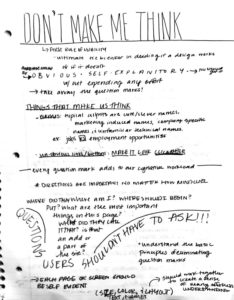
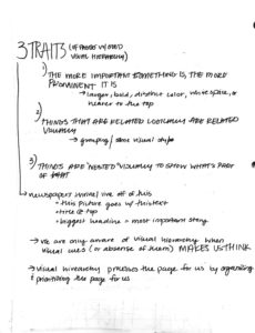
This project stretched me as a designer a lot more than I thought it could/would. Through this process I sketched at least over 100 design concepts, Illustrated at least 50 more variations, and finally settled on a Logo design! Through this long process I developed a brand logo design. This Logo really reflects myself and my personal brand and I think will be able to adapt with my growing design style and be used in many forms throughout my career. No, this logo may not look the same a few years from now, but I feel it gives me a good base. I say this because I am still learning and growing as a designer and expect my logo to change and grow as I do. This logo represents me right now where I'm at in my career as a little design baby. This project taught me that there is never such thing as too many sketches or too many variations. Completely refining out my design may have been an extensive process, but the progress shows in growth of the design along the way. This logo will hopefully progress as I do, and take my portfolio and my work to a new level of professionalism.

RESEARCH:

This process started with research about the Graphic Design Industry, current Graphic Designers process into developing their brand logo, and research into myself and what my design style and brand was!

Q&A with a Real Live Designer:

Q:What graphic design work are you doing currently?

A:Currently do freelance designwork for our church

Q:What aspects of design made you want to pursue that as a career?

A:Always enjoyed art growing up and wanted to make things beautiful.

Q:What artists or styles of design inspire you?

A:Alphonse Mucha of the Art Nouveau Period is one of my favorite artists/styles. His work was brilliant and intricate. His typography from that time period is really lovely, too.

Q:How would you describe your style as a designer, and what is one piece you’ve done that most reflects that?
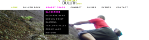
A:Like to keep colors simple and font choices simple, too, so that the design looks neat and easy to follow. Enjoyed designing a logo for a bible school in Germany. You can check it out at http://www.bodenseehof.de/en (or shown below)

Q:How did you find your style as a designer?

A:I had some excellent teachers at College that really helped me along the way. Specifically my Typography professor and Graphic Design professor. They shared great designers and the skills needed.

Q:What type of graphic design work do you enjoy doing most?

A:I prefer print work the most. Logos is a favorite. Brochures, bookmarks, etc.

Q:If you could describe your personal brand as a designer in a couple words, what would it be?

A:Neat, tidy, detail oriented.

Q:What tools or software do you prefer to use in your work?

A:Like all software in the Adobe Creative Suite. Adobe Illustrator is a personal favorite as it is a great program for Logo design and modifying type.

Q:Do you ever find yourself in a creative rut and if so, are there any methods you’ve discovered that have helped you combat this

A:Looking at other artists, getting inspired by word studies (about what you need to design), finding an interesting photo that will be a centerpiece for your work, etc can help spark design.

Q:What hobbies do you have and how do those inspire your style?

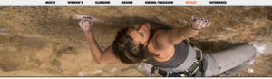
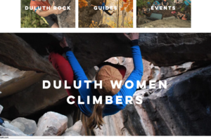
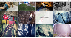
A:Enjoy rock-climbing when I have the time. Sewing is another interest. Home- decorating (painting, photos, lay-outs). Flower gardening. All are outlets for creativity.

Q:What aspects of graphic design do you dislike the most?

A:Not as much a fan of web design, but it is a good skill to have in the design field.

Q:What do you think is the biggest factor that leads to success in the graphic design field?

A:Great teachers are a big help, especially if they help you create an excellent portfolio. Becoming proficient in computer design software is a big help. Mastering the basics, like good layouts, type, etc.

Q:What motivates you as a designer and how do they influence your design?

A:Seeing others enjoy something I’ve created.

Q:What the biggest thing you’ve learned from the field so far in your career?

A:I used to think I always had to spend hours working on a piece (sometimes this is required), but when I worked in advertising design for a newspaper, I found that I could creatively put together designs at a quick pace. It gave me a lot of confidence in my design work.

Q:What one piece of advice would you give to a college student who is currently studying to enter the graphic design industry

A:Find a great internship to help you get some design experience. Work hard to have a good portfolio (showing a variety of types of design work...only include excellent pieces...less is more!)

Throughout the process of interviewing designers, I found that most of them developed their Personal Brand and Logo over time. They didn't end up with their brand logo on a whim or right away, it was a process that developed over the course of their career. Some didn't keep their first logo they came up with, but others did. Above I have posted a series of Q&A's with my Aunt who is a graphic designer. When reading back through the answers, I thought they were very insightful for young designers working on developing and processing their personal design brand.

Personal Brand Development:

One of the first steps I took was to develop some elements and emotions that I felt, myself as a designer and brand, reflected.

  • Organic/Nature
  • Active/Movement
  • Unique/Funky
  • Creative/Expressive
  • Handmade/Flawed
  • Happy/Energy

Mood Board:

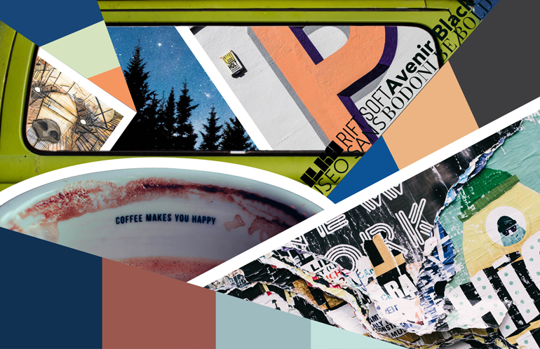
To help further develop my logo design process, I created a Mood Board. On this board I collected images, colors, inspirations, and Found Type. Through this I was able to further process those elements and emotions and narrow down which were most important to my brand. This mood board was really an exploration to find the path I wanted to take to developing my logo.
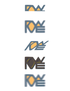
SKETCHES:

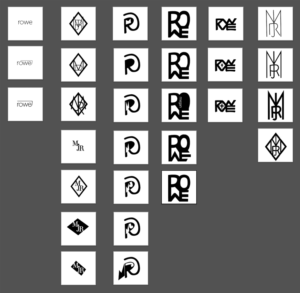
Next came the process of putting onto paper and into illustrator, the ideas and concepts I created for my logo. I started out with 50 sketches, picked five and expanded 50 more off of those. Then pulled five more expansion sketches into Illustrator and fleshed out those as much as I could. Then two logo ideas were chosen and modified and developed as much as possible through different line styles, thicknesses, colors, and sizes. Finally, the finished product was chosen, and so became my brand logo.

FINAL LOGO DESIGN:

The final logo I came up with, really captures where I'm at as a designer right now, and can adapt with me in the years to come. Originally, I was worried to create something that had too many visual elements, as I didn't want to overwhelm the design. But through this I've found a happy medium ground, where the logo has expressive movement but isn't too overwhelming at the same time.

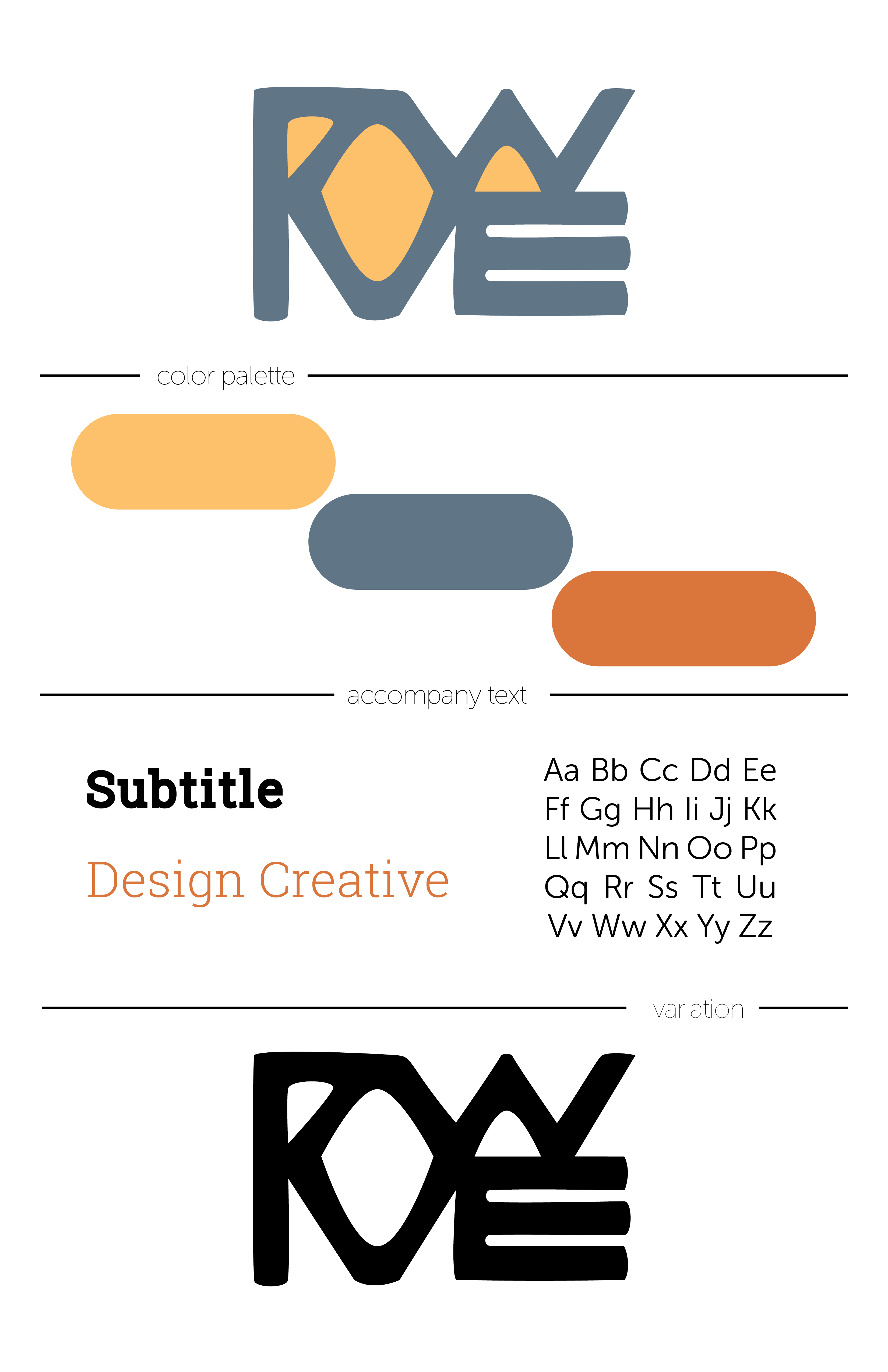
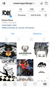
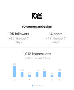
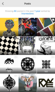
This logo I feel can be applied to many applications whether it is a website, business card, header, and most importantly a coffee mug! (You've gotta think about the important things here!)

Logo Testing: 

After choosing my final logo, I had to test it to see if it would hold up against different factors it may come in contact with. My logo seems to handle these different effects pretty well while still remaining legible and recognizable. This just further proving the durability and adaptability of my logo.

September 13, 2017Comments are off for this post.

Post No. 3

After tracking my use of emerging media for a week, the results were eye opening. Through this exercise I found that I used some form of emerging media almost throughout my entire day. These new and upcoming forms of communication are all around us and are constantly in use. I found that many of my classes involved me being interactive with these platforms. I started to see patterns of my use of emerging media and found that there wasn't many breaks in my day in which I wasn't using or exposed to it. On average I would say that over 80% of my day involved emerging media in some way. Whether it was checking/using my email for class and personal work, checking several forms of social media (Facebook, Instagram, Snapchat, Pinterest etc.), or even listening to music through my computer or radio. There are so many forms of emerging media that I don't think it would be beneficial for me to list them all in this blog post. However I do feel its beneficial to list the ones that most surprised me or that I hadn't noticed before this assignment.

I found it interesting realizing how many things are considered emerging media and just how easily accessible they are. I also noticed just how much of my day is consumed by emerging media. From listening to music on my computer to help me focus, to looking into and keeping up with social media while just waiting in line at the coffee shop. Now a days, there's not a lot of time that we take to just sit and be in the world around us. Rather we are finding time and ways to constantly stay connected and interact with the technology we have such easy access to. I also noticed how most days the first thing I do and the last thing I do is use emerging media. Normally its checking my phone and social media in the morning and watching an episode on Netflix at night or scrolling through social media till I fall asleep.

Here's a thought, what would happen if we didn't use any form of emerging media for a whole day? Could we keep up with life and feel connected to those around us, if we didn't have eight different forms of technological communication to use to stay caught up?

I don't think that this is possible in my life just noticing how much I even use emerging media for classes and work. Heck, I'm using it right now to make this post! I don't think there's anyway to really get away from emerging media in the world we live in today. But being aware of its presence in our world and knowing how to most effectively apply these technologies in our lives can make sure we are using our time and technology wisely.


September 13, 2017Comments are off for this post.

Post No. 4

The Graphic Design Industry has and will be ever changing and and growing with the world that demands it. Throughout the past few years the profession has greatly expanded. Through this, realizing theres a need for people from cross disciplines with a variety of background and skill set.  The AIGA salary review pointed out a troubling insight. "the number of graphic designers is not recovering as quickly from the impact of the Great Recession as we had hoped. yet other roles we now include within the evolving profession and out membership—user-experience design, interaction design, software development, etc.—continue to grow." This can be discouraging to some, but to me this is only a motivation to grow into the designer that the field demands now more than ever. I believe there has also been a rise in up and coming graphic designers to fill the need that is ever growing. There were also more positives from this review. It revealed that out of the designers in this field 96% of these creative minds were happy in their career, and that 88% believe that there is hope for this industry and that the best of the industry is yet to come. In that being said, theres excitement in the fact that the designers of my time could be the ones to bring the best ages of design to our future! Maybe thats too hopeful and optimistic, yes there should be boundaries to our aspirations that keep them practical. But I can only hope that by finding a career that I'm truly happy in, I can also be bringing in the new times of design along side my fellow creatives in this field.

©2023 Megan Rowe

(507)-272-4116      |      meganroweeeee@gmail.com

(507)-272-4116      |      rowex204@d.umn.edu