
Book Reading, Notes, and Analysis:
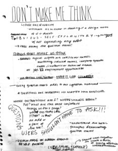
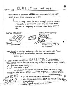
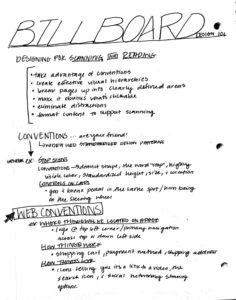
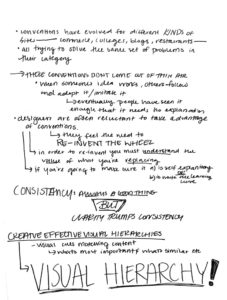
The book Don't Make Me Think, Revisited by Steve Krug brings up some really good points about web users and how we browse. Chapters 1, 2 and 3 all focus on how to build a website geared towards the viewer and how they process, browse, and use websites. After reading these chapters, I realized just how much of these design tools I just over looked because they became familiar and normal to me. Being aware of the obvious and simple design techniques can turn a bad website into a great one, that viewers will come back to revisit and use. One of the biggest take home points for me, was just how crucial it was to make the design and site simple. I feel as a designer I've always got a big picture in mind and sometimes get caught up in all the details that it becomes WAY to complicated. These chapters focused on making sites self explanatory and obvious for the user. After keeping this in mind I realized that many sites don't do this and overall, fail at making their users experience positive and beneficial.

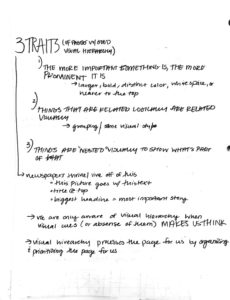
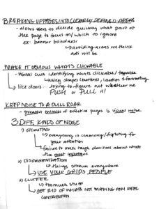
Once we read these chapters, we went out onto the web ourselves and found sites that we thought were effectively utilizing the design strategies that these chapters talked about. Throughout my search, I found myself looking for tools I always just glanced over. I realized the intent behind all of these specific design decisions and how they reflected on the company and their products and their brand.
Website Research and Analysis:
https://www.nhl.com/wild/
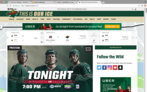
- This first link is for the website for the Minnesota Wild. I believe this website does a great job illustrating the motivation aspect of semiotics. I say this because as hockey is an exciting sport, the main design focuses on the game/players. Also, I think the site does a great job with it’s color palette. While yes the site does use the colors from the team, it lays out the colors in a way that organizes the information, and makes the navigational process easier for the viewer.
http://www.hyperlite.com/
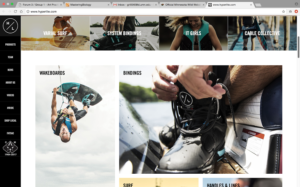
- The second link is for Hyperlite which is a wakeboarding company. This site does a great job of using signs to help the viewer navigate the page. I say this because all the text/signs are laid out either vertically or horizontally. The signs all flow between one another which results in the viewer’s eye being drawn across the entire page. This makes all the information easier to process, and allows the user to better navigate the page. Also, the images they use do a great job of representing the brand, and the laid back/modern feel that goes along with wakeboarding today.
http://www.cabelas.com/
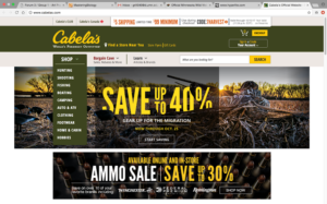
- The third link is for Cabela’s which is a hunting outfitter. This website does a great job of utilizing signs as well. Like the Hyperlite site, this site does a great job of creating flow between signs through out the page however, it does this in a different way. Unlike the Hyperlite site, this site organizes everything vertically, which draws the viewer’s eye downward. As the viewer is drawn downward, they are able to view and process all the information on the page making the site very easily navigable.
https://www.ronixwake.com/
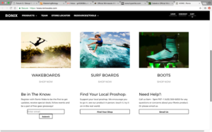
- The fourth link is for Ronix, which is another wakeboarding company. This site does a great job using a specific category of sign. The site uses signs which all depict real photos of athletes using their products. This signifies to the user that these are the kinds of products they can hope to find on this site. There is also a ‘shop now’ link directly below each photo which takes the user directly to the section of the website that deals which each respective category. This makes the whole navigation process very streamlined and simplified for the viewer.
https://www.fender.com/
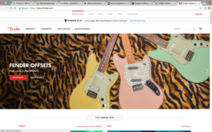
- The fifth link is for Fender which is a guitar manufacturer. This site does a great job of using iconic signs to help the viewer navigate the page. The most prominent image on the page is of three guitars which are named the ‘Fender Stratocasters’. The Stratocaster is a very iconic guitar design and has been used by many very famous musicians, so using this image as the most prominent sign on the page lets the viewer know what they can expect to find on this website. Also, the necks of the guitars all lead up, which draws the viewer’s eye to the top banner that contains the navigation tabs for the site.
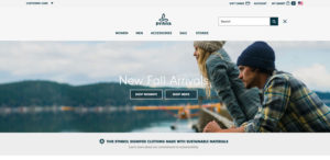
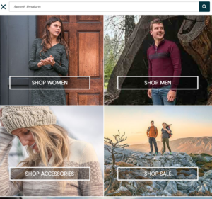
- This website used simple clean organization of their information to create a website that is easy and self-explanatory for their customers. They use simple icons to show recognizable features such as the search and shopping cart features. These features are well known to many users of the internet, so not changing or trying to be innovative in this area helps keep this are of the site simple and effective. When you get to the dropdown features they succeed in their simple lists with easy to process word choices and break downs of options. They also use pictures to show certain features. Semiotics is used a lot through this site by colors chosen. We see colors that give a heavy sense of nature and earth which is really what their clothing is made for and what this company is passionate about. Finally, the Prana logo is an symbol which has no real direct link, viewers have learned to associate this logo with the brand and its clothing and its purpose. I think this website is overall very successful in using semiotics to create a self-explanatory website that users will come back to again and again.
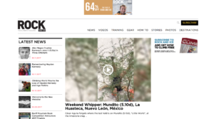

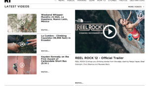

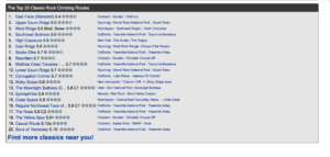
- This website uses semiotics and basic principles of hierarchy well. They set up their site about rock and ice climbing news and stories like a newspaper would. They do the work for us by making headlining articles have larger text and presence on the screen. They also chose nice and simple navigation terms for the user to understand and use effectively. Their logo is an index of the company name and what their focus is. The RI is simple and to the point which I think compliments them and their website well. They don’t use bright flashy colors instead they use black text on a white background. They also use simple black bars to divide information and sections of their page. This allows for the articles, videos, and pictures to speak for themselves and gives the site a clean look. They benefit well from using symbols and layouts that have become second nature to internet users.
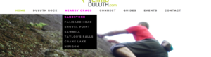
https://www.mountainproject.com
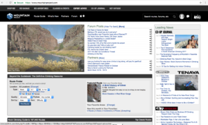
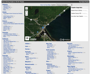
- This site is used for navigation of different crags (sites), location of routes and areas all across the globe. Climbers can download this app and download certain areas and have access to pictures, descriptions, and maps of the areas they’re going to be climbing in. This is the digital version of what used to be the must-have climber tool, a guide book. Since this site is used for actual navigation, it’s vital its own navigation and flow be easy and straight forward. This site uses clean colors, navigation tools, type choices, and layout to create an easy manageable page.It uses blue to show you what you are able to click on and access more information about the link you clicked. It also has a basic layout to the pages. With the titles at the top in a rust orange color and making its way down to a description of the state/place, climbing area lists, charts, and then favored routes at this crag, and finally pictures of routes to help you see what you could be climbing. This site’s logo is a direct index to the content of the page. It is a mountain and a climber’s silhouette in the white. They reflect the colors of their logo in their page by using the mellow blue and white to create an overall look and feel to the page. The site doesn’t make the user think too hard to find what information they’re looking for, allowing for more time climbing/day dreaming of climbing instead of figuring out the puzzle of a poorly designed site.
http://blackdiamondequipment.com/
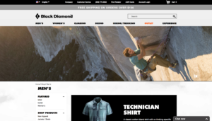

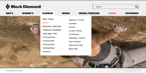
- This site is a gear site for all those climbing, hiking, skiing, trekking, and outdoorsy folks. This site straight out shows you banners of their products being used across the page. Not going to lie, it’s a pretty good marketing strategy. Put a picture of the place I’d rather be right across the front of the page. They keep this simple persuasive feature on most of their linked pages as you browse the site, showing their products being used/in action. This is a simple and intriguing feature that helps you as a viewer directly link the products to the name and what you could be experiencing. They use black and greys throughout the layout to create a simple look that allows the viewers eyes some vital rest from all the gear and information. To show that you have hovered over an option/link that you can click on. You can see their logo that is a symbol that over time has become associated with their quality brand. This quality also shows through on their site as you can see they’ve taken the time to make it self-explanatory. Some conventions they used were the organic colors they used like the greys and blacks that make me think about rock and mountains. The colors also tie back into their logo. They also used thicker text choices that give me a sense of durability and gear that that will last through the tough climbs, hikes, and adventures.
- This site also uses clear and simple semiotics to create an experience for the viewer that will make them want to return to the site again. This site doesn’t overwhelm you with large groupings of text, instead they use big colored bars to separate information and allow the viewer needed processing time and visuals. The text they used is a heavier sans serif font that has clean edges, which I like because I don’t have to take time to squint/decipher the information. They use simple scrolling guides to fluidly move through information and links so you can effortlessly browse. Their picture boxes are used as the links for viewers to click on which gives the viewer a little bit bigger of an area to click. The page uses its pictures heavily and has hover over features that display a caption for the pictures with an opaque color over the picture. They use bright pink as their hover color on text that leads to other pages which is a bright surprise alongside the sites mainly black and white theme. This site is overall shows clean and simple features that make the viewers experience not confusing and enjoyable.
No comments.